Lifti
The Initial Idea
The initial idea of Lifti came from the fact that there are a lot of cars in the Botswana, and most people work and live in the same places. It could be Commerce Park, or Fairgrounds, or Mogoditshane, or BBS etc, so we thought it should be possible for these people to share cars and travel together. Its a win win in the end, you make friends, help others and sometimes make extra cash. Also, people can travel together using the same platform for longer trips, for example during holidays when we all want to go back to our home villages. We thought it would be nice to have a central place where people could find a list of all the lifts available and they can look for one that suits them and make a lift request and travel together.
It’s a platform where we didnt want to make money, but to simply use technology to connect people and hopefully make the world a better place. There has been a lot of concern recently regarding carbon footprints and global warming, and this is our way of contributing positively towards this.
Logo Design
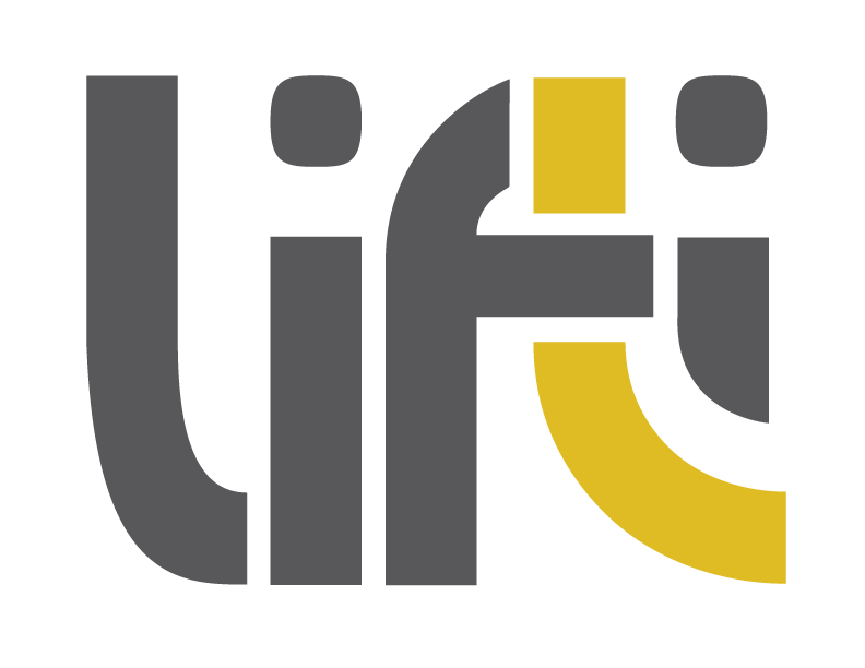
The logo was commissioned from a local designer. The idea was to have a simple but nice logo, that also has takes some meaning from the idea of Lifti itself. If you notice, the F, the T and the I have a little thing going, in that they could be said to be lifting each other up in a way. The color choices were also important, a grey to represent the idea of the travel industry itself, and the yellow to add a dash of color and playfulness to the whole thing. It worked really well in the end.
The Stack
Lifti was built by using NodeJS in the backend, and CSS, HTML5 and Javascript in the front end. We were tempted to use AngularJS in the front end, but we were concerned about taking too long to bring something to market, for an idea that was mostly experimental and wasn’t going to be monetized.
Fonts Used
In all our designs, one of the things we try to nail down as soon as possible is the fonts to use. Proper typography makes all the difference in a design. Normally we try to pair a sans-serif font with a serif font, but in this case we found a perfect combination of sans-serif fonts and bent the rules a bit.
Abel
For the headings, we chose Abel, a nice clean Google Font that works well for headings. It is clean and very legible, and makes the headings really stand out.
Roboto
For the body text, we went with Roboto, which is the main Google font for Android. It is a very clean and legible font, perfect for body text. It also works very well with our choice for the heading text, Abel.
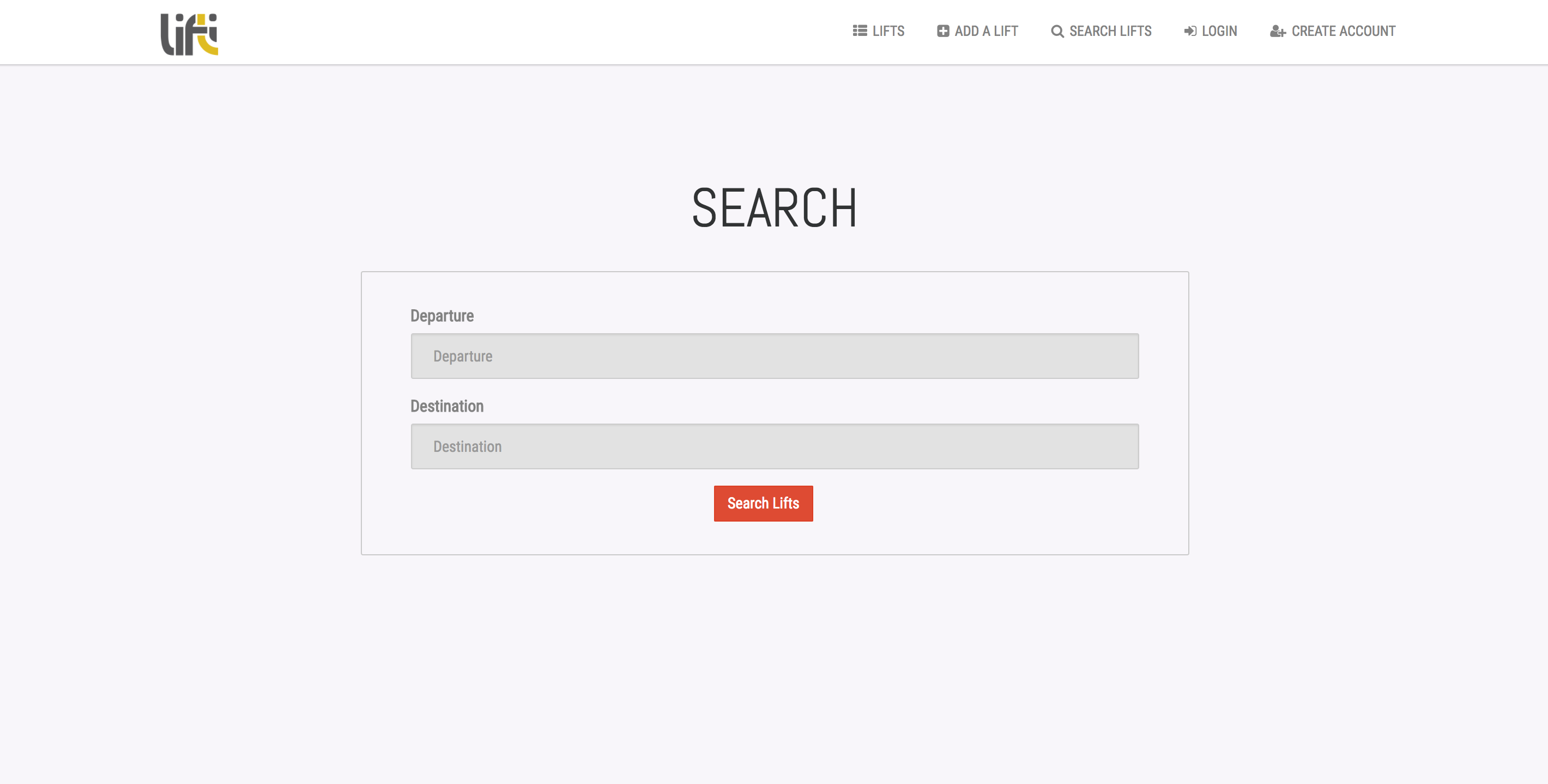
Design
We believe in simplicity, above all else. When a design is simple, it becomes a lot more usable, and can fulfill whatever use we want it to perform. Clutter on the other hand, hides away important functionalities, and confuses users. We wanted the site to be clean and minimal, so we paired mostly greys for the background and dark grey for the text. We made sure to balance it off by adding bright colors to our buttons so they stand out a lot more. We also made sure to use bright colors for notifications, to make sure we really get our users’ attention when it really matters.