Reo Properties
The Client Brief
The owner of Reo Properties is an old friend, and one day he got in touch because his company had grown and needed a web presence. We agreed wholeheartedly, its important for companies to be on the internet nowadays so they can remain competitive. Reo Properties is a real estate company, they connect landlords with tenants, which is a very big market in Botswana. People are always looking for houses to rent or buy, or they want better houses than the ones they currently occupy, and someone needs to be able to make all these connections.
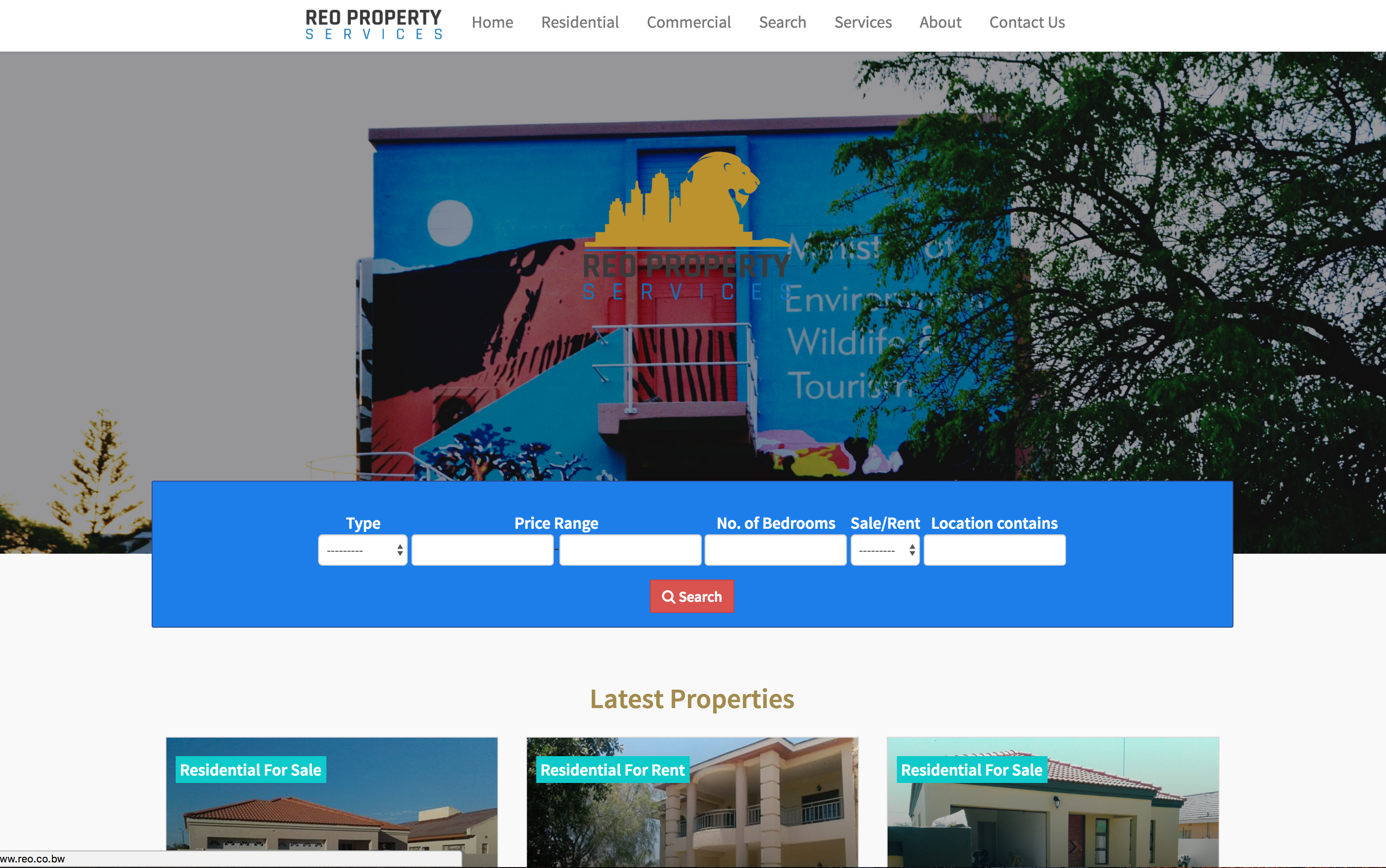
The site would need to list all their currently available properties, have all the details visible to the user such as the prices, availablity, whether they are for sale or for rent, the location etc etc. The client had a basic idea of the sort of sites they wanted to benchmark on, and what they want their site to have in terms of content and so on. But the task on settling on a design was lef to us, the agreement was we would build what we had in mind, also incorporating ideas from the benchmark websites, then have the client review the site and we would then see whether to revise the design or to carry on with our approach.
Logo Design
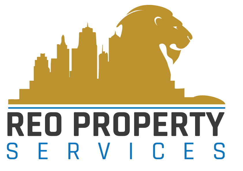
The logo was commissioned from a local designer, the same designer who did the Lifti logo. There had been a previous logo, which we felt had not been done very well, and so we set out to take ideas from the old logo, which the client liked, and to clean it up and make it better. The client likes the idea of a lion, the spirit that the lion represents, and also real estate itself, so the logo had to have these two elements together. They also had gold as their main color, so the logo designer had to use gold in the logo. In the end, it worked very well, and the client was very happy with the new logo, and we loved the results as well.
The Stack
The client wanted to be able to update the site content on their own, and to be able to add new properties as they got more clients, so we needed to set up a CMS for them. We love Django, a Python CMS, and we use that for most of our clients who want a CMS. We then did a short training session for the client after launch so they could update the site on their own.
For the frontend we used the usual suspects, CSS and Javascript.
Photography
We needed to use imagery from Botswana, Gaborone to be specific, and we couldn’t just get stock photos because you would rarely find any photos of our beloved city in any of these sites. So we commissioned photos from a local photography company to take photos of some of the best places in the city for Reo’s image bank, and we chose some from here to use on the website. The results were stunning, there were some very nice photos that came out from the shoot, which we used for the main slider on the home page.
Fonts Used
Source Sans Pro
We decided to use one font across the site, we had tried some combos and when we finally settled on Source Sans Pro we found it worked perfectly on its own, which to us meant quicker load times for the site, which is also very important.
Design
The client also believes in minimalism as much as we do, and so the choice of design was easy. We used gold for all the main headings, as it is the company’s main color, and for the rest of the site played with shades of blue for different sections to give the site balance.